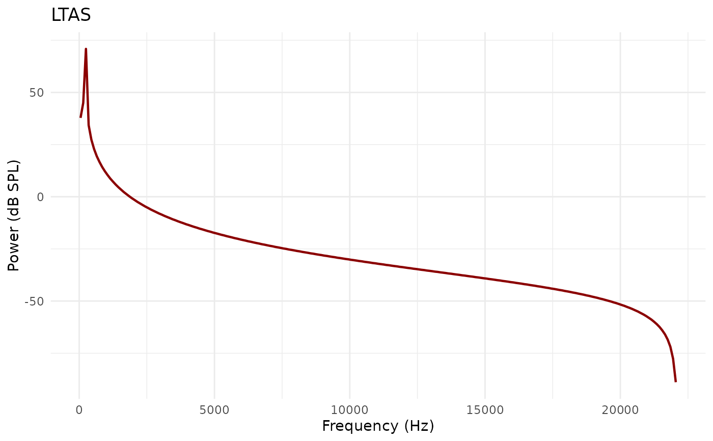
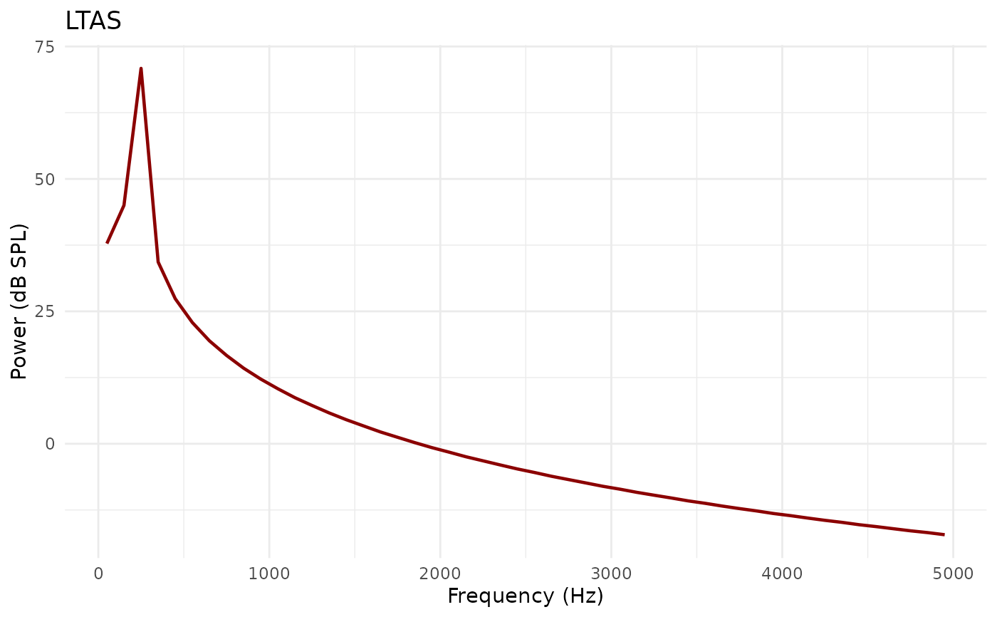
Creates a LTAS (long-term average spectrum) visualization.
Usage
# S3 method for class 'Ltas'
plot(
  x,
  from_freq = NULL,
  to_freq = NULL,
  log_freq = FALSE,
  garnish = TRUE,
  title = "LTAS",
  color = "darkred",
  ...
)
Arguments
- x
Ltas object
- from_freq
Start frequency in Hz (NULL = from 0)
- to_freq
End frequency in Hz (NULL = to maximum)
- log_freq
Logical. Use logarithmic frequency scale (default: FALSE)
- garnish
Logical. Add axis labels and title (default: TRUE)
- title
Character. Plot title (default: "LTAS")
- color
Character. Line color (default: "darkred")
- ...
Additional arguments passed to the underlying function or ignored.