library(pladdrr)
#> pladdrr: direct access to Praat's core algorithms from R.
#> See ?pladdrr for an overview, or citation("pladdrr") for citation details.
library(ggplot2)
Introduction
pladdrr returns data as data frames (
as_data_frame( ) methods) and matrices
(as_matrix() methods) that plot directly with
ggplot2, and it also ships a few ggplot2-based
helper functions (plot_powercepstrum(),
plot_powercepstrogram(),
plot_cpp_timeseries(),
create_cepstrum_report()) and
autoplot/autolayer methods for common object
types (Sound, Pitch, Intensity,
Formant, Spectrum, Spectrogram,
Ltas, TextGrid, Harmonicity,
PointProcess, PowerCepstrum).
Plots produced this way are ordinary ggplot2 objects:
they can be saved as PDF/SVG/PNG with `ggsave(
), themed and recolored with standardggplot2calls, and combined withgridExtra::grid.arrange()orpatchwork`.
This vignette demonstrates the plotting functions available in
pladdrr, organized by analysis type.
Cepstral Analysis Visualization
Cepstral analysis is essential for voice quality assessment, particularly for measuring periodicity (
CPP - Cepstral Peak Prominence).
Power Cepstrum
Visualize a single power cepstrum with peak detection:
# Create a PowerCepstrum object (Sound -> Spectrum -> PowerCepstrum)
sound <- Sound$new(system.file("extdata", "test.wav", package = "pladdrr"))
cepstrum <- sound$to_spectrum()$to_power_cepstrum()

# Plot with peak annotation
plot_powercepstrum(
  cepstrum,
  show_peak = TRUE,
  show_trendline = TRUE,
  fit_method = "exponential decay",
  title = "Power Cepstrum with CPP Peak"
)
#> Warning in value[[3L]](cond): Could not compute peak: unused arguments (qmin =
#> 0.001, qmax = 0)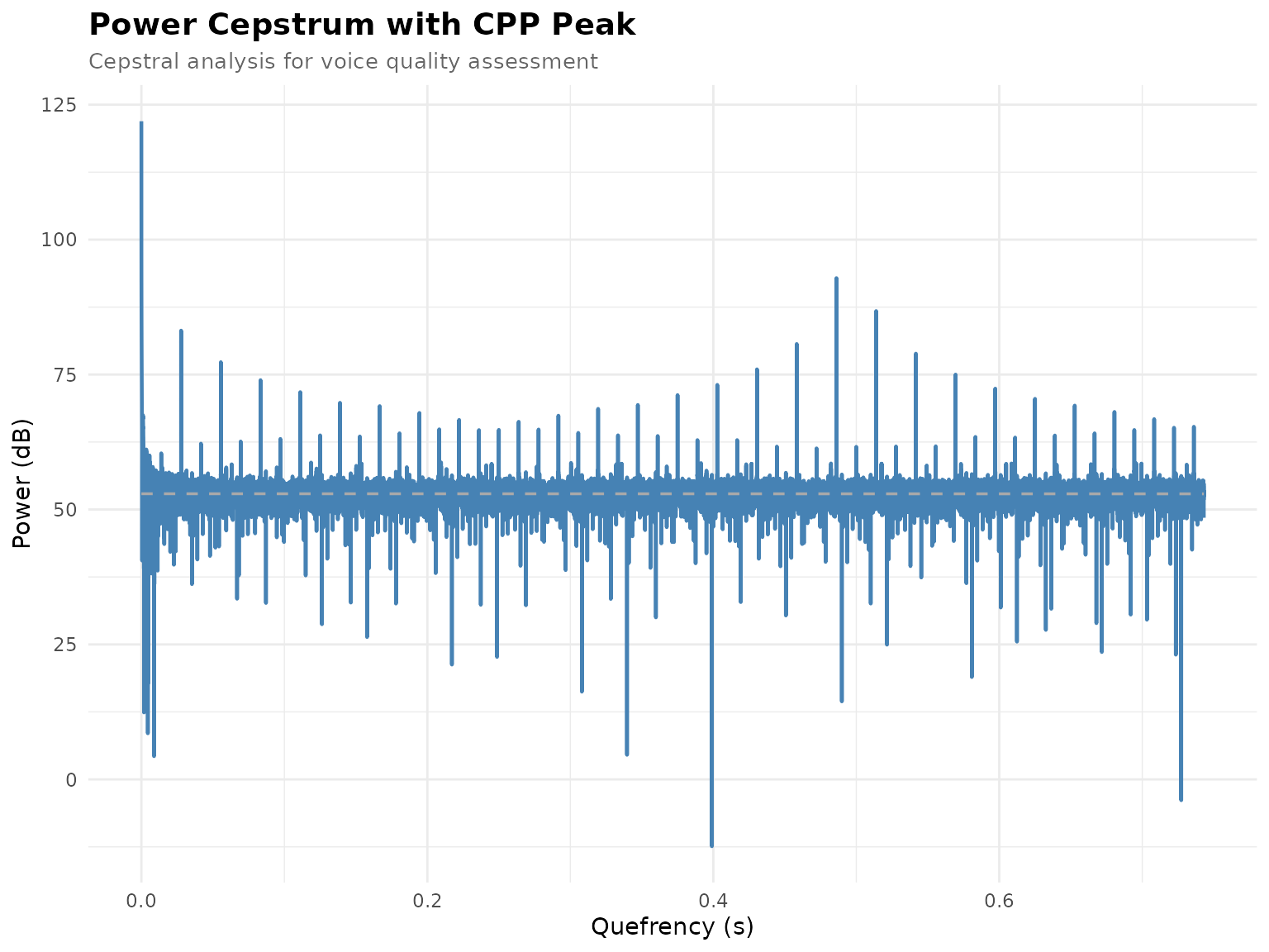
Parameters:
-
show_peak- Highlight the cepstral peak (CPP location) -
show_trendline- Display regression line for trend removal -
fit_method- Trend line type: “straight”, “exponential decay”, or “parabolic” -
quefrency_range- X-axis limits (in seconds) -
db_range- Y-axis limits (in dB) -
theme- ggplot2 theme: “minimal”, “bw”, or “classic”
Power Cepstrogram
Time-varying cepstral analysis (heatmap):
# Create PowerCepstrogram
cepstrogram <- sound$to_powercepstrogram(
  pitch_floor = 60,
  time_step = 0.002,
  maximum_frequency = 5000,
  pre_emphasis_frequency = 50
)

# Heatmap visualization
plot_powercepstrogram(
  cepstrogram,
  quefrency_range = c(0.001, 0.05),
  db_range = c(20, 80),
  color_scale = "viridis"
)
#> Scale for fill is already present.
#> Adding another scale for fill, which will replace the existing scale.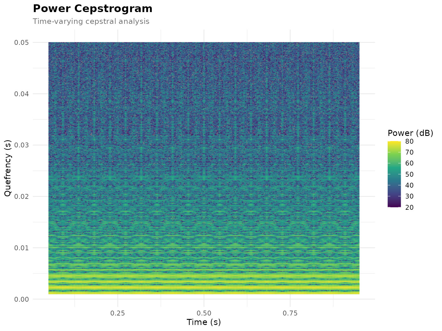
Color scales (color_scale
argument):
- “viridis” (default) - Perceptually uniform, colorblind-friendly
- “magma”, “inferno”, “plasma” - Alternative viridis variants
CPP Time Series
Track Cepstral Peak Prominence over time:
# CPP time series with smoothing
plot_cpp_timeseries(
  cepstrogram,
  smooth = TRUE,
  title = "CPP Over Time"
)
#> `geom_smooth()` using formula = 'y ~ x'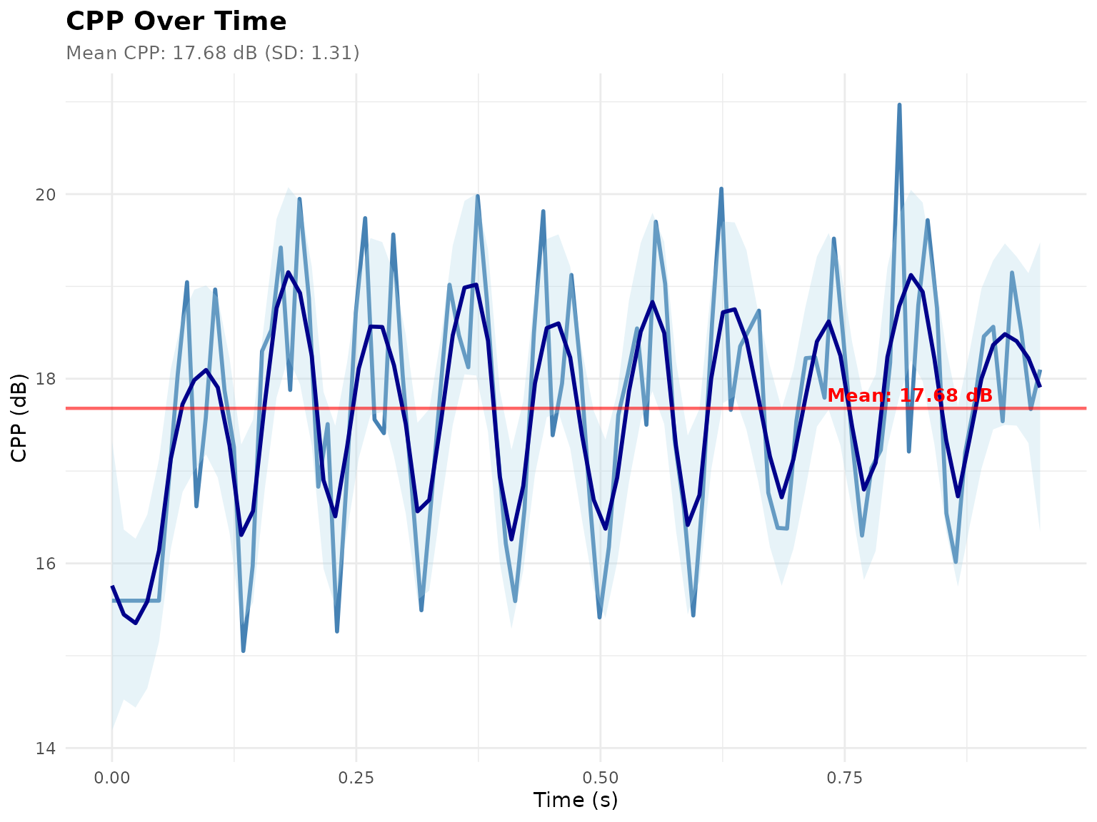
Features:
- CPP values sampled across the cepstrogram’s time range
- Optional loess smoothing (
smooth = TRUE) - Mean CPP reference line (always drawn)
- Optional horizontal reference lines (
reference_linesargument)
Comprehensive Cepstrum Report
Multi-panel diagnostic figure combining all cepstral visualizations:
# Complete cepstral analysis report (power cepstrum + cepstrogram + CPP time
#  series)
report_plot <- create_cepstrum_report(cepstrogram = cepstrogram)
#> Warning in value[[3L]](cond): Could not compute peak: unused arguments (qmin =
#> 0.001, qmax = 0)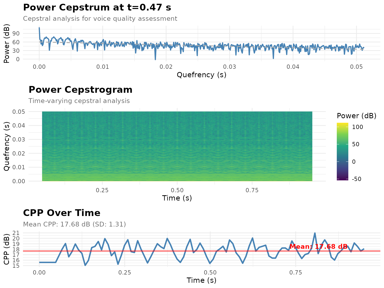
Report panels (stacked with
gridExtra::grid.arrange()):
- PowerCepstrum at a single time slice - with peak and trendline
- PowerCepstrogram - time-quefrency heatmap
- CPP Time Series - CPP values over time
Formant Visualization
F1-F2 Formant Space
F1-F2 plots by segment label (the pattern is the same for vowel-only
data; the bundled test.TextGrid has phone labels, not
exclusively vowels):
# Extract formants at the midpoint of each labeled interval on the "phones" tier
sound <- Sound$new(system.file("extdata", "test.wav", package = "pladdrr"))
textgrid <- TextGrid$new(
  system.file("extdata", "test.TextGrid", package = "pladdrr"))

formant_data <- data.frame(
  vowel = character(),
  F1 = numeric(),
  F2 = numeric(),
  F3 = numeric()
)

tier <- 2  # "phones" tier
formant <- sound$to_formant_burg()
n_intervals <- textgrid$get_number_of_intervals(tier)
for (i in seq_len(n_intervals)) {
  label <- textgrid$get_interval_text(tier, i)
  if (label != "") {
    t_start <- textgrid$get_interval_start_time(tier, i)
    t_end <- textgrid$get_interval_end_time(tier, i)
    t_mid <- (t_start + t_end) / 2

    f1 <- formant$get_value_at_time(1, t_mid, "hertz")
    f2 <- formant$get_value_at_time(2, t_mid, "hertz")
    f3 <- formant$get_value_at_time(3, t_mid, "hertz")

    formant_data <- rbind(formant_data, data.frame(
      vowel = label,
      F1 = f1,
      F2 = f2,
      F3 = f3
    ))
  }
}

# Create vowel space plot
ggplot(formant_data, aes(x = F2, y = F1, color = vowel, label = vowel)) +
  geom_point(size = 4, alpha = 0.7) +
  geom_text(vjust = -1, size = 5) +
  scale_x_reverse() +  # F2 decreases left to right
  scale_y_reverse() +  # F1 decreases bottom to top
  labs(
    title = "Formant Space (F1-F2) by Segment",
    x = "F2 (Hz)",
    y = "F1 (Hz)"
  ) +
  theme_minimal() +
  theme(legend.position = "none")
#> Warning: Removed 4 rows containing missing values or values outside the scale range
#> (`geom_point()`).
#> Warning: Removed 4 rows containing missing values or values outside the scale range
#> (`geom_text()`).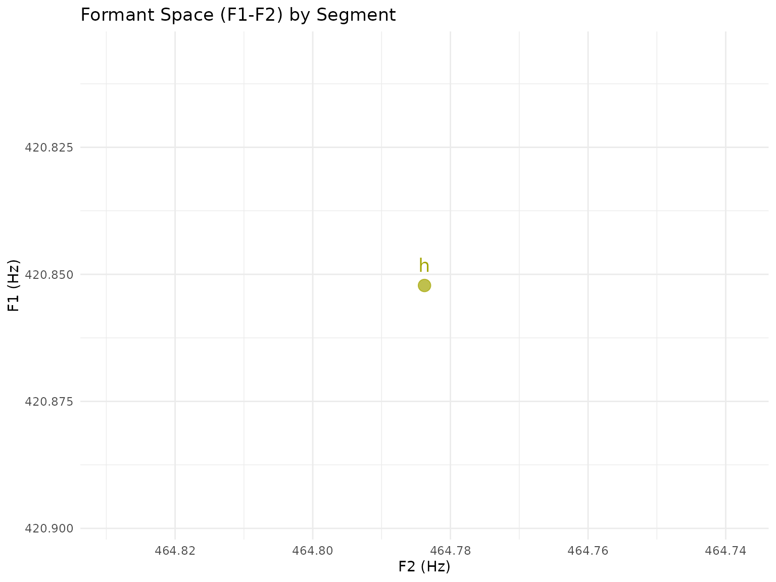
Formant Trajectories
Visualize formant movement over time:
# Extract formant tracks
formant <- sound$to_formant_burg(
  time_step = 0.01,
  max_number_of_formants = 5,
  maximum_formant = 5500
)

# as_data_frame() returns long format: one row per (time, formant number).
# Keep F1-F3 and reshape to wide for a multi-line plot.
formant_df <- formant$as_data_frame()
formant_df <- formant_df[formant_df$formant <= 3, ]
formant_wide <- data.table::dcast(formant_df, time ~ formant,
  value.var = "frequency")
data.table::setnames(formant_wide, c("1", "2", "3"), c("F1", "F2", "F3"))

# Plot F1-F3 over time
ggplot(formant_wide, aes(x = time)) +
  geom_line(aes(y = F1, color = "F1"), linewidth = 1) +
  geom_line(aes(y = F2, color = "F2"), linewidth = 1) +
  geom_line(aes(y = F3, color = "F3"), linewidth = 1) +
  scale_color_manual(
    name = "Formant",
    values = c("F1" = "#E41A1C", "F2" = "#377EB8", "F3" = "#4DAF4A")
  ) +
  labs(
    title = "Formant Trajectories",
    x = "Time (s)",
    y = "Frequency (Hz)"
  ) +
  theme_minimal()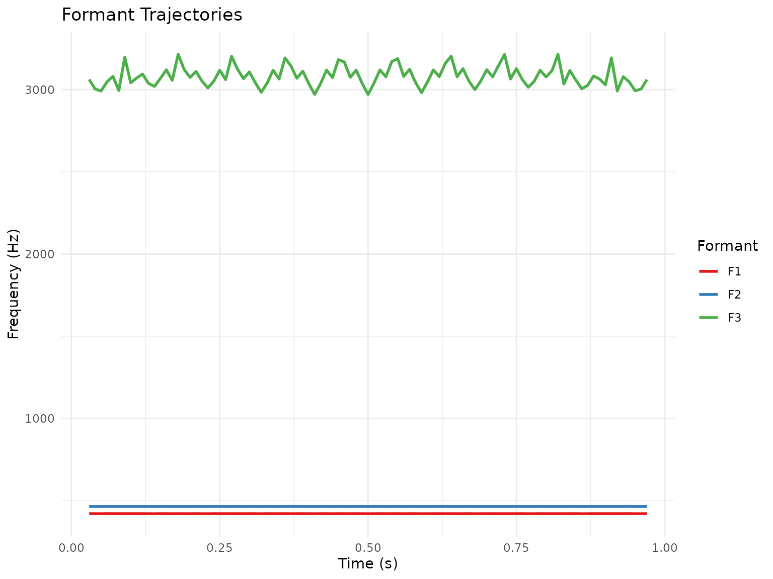
autoplot(formant) and
ggplot() + autolayer(formant) provide the same F1-F3
trajectory plot without manual reshaping.
Pitch and Intensity Visualization
Pitch Contour
# Extract pitch
sound <- Sound$new(system.file("extdata", "test.wav", package = "pladdrr"))
pitch <- sound$to_pitch()

# Convert to data frame
pitch_df <- pitch$as_data_frame()

# Plot pitch contour
ggplot(pitch_df, aes(x = time, y = frequency)) +
  geom_line(color = "#1f77b4", linewidth = 0.8) +
  geom_point(color = "#1f77b4", size = 1, alpha = 0.5) +
  labs(
    title = "Fundamental Frequency (F0) Contour",
    x = "Time (s)",
    y = "Frequency (Hz)"
  ) +
  theme_minimal()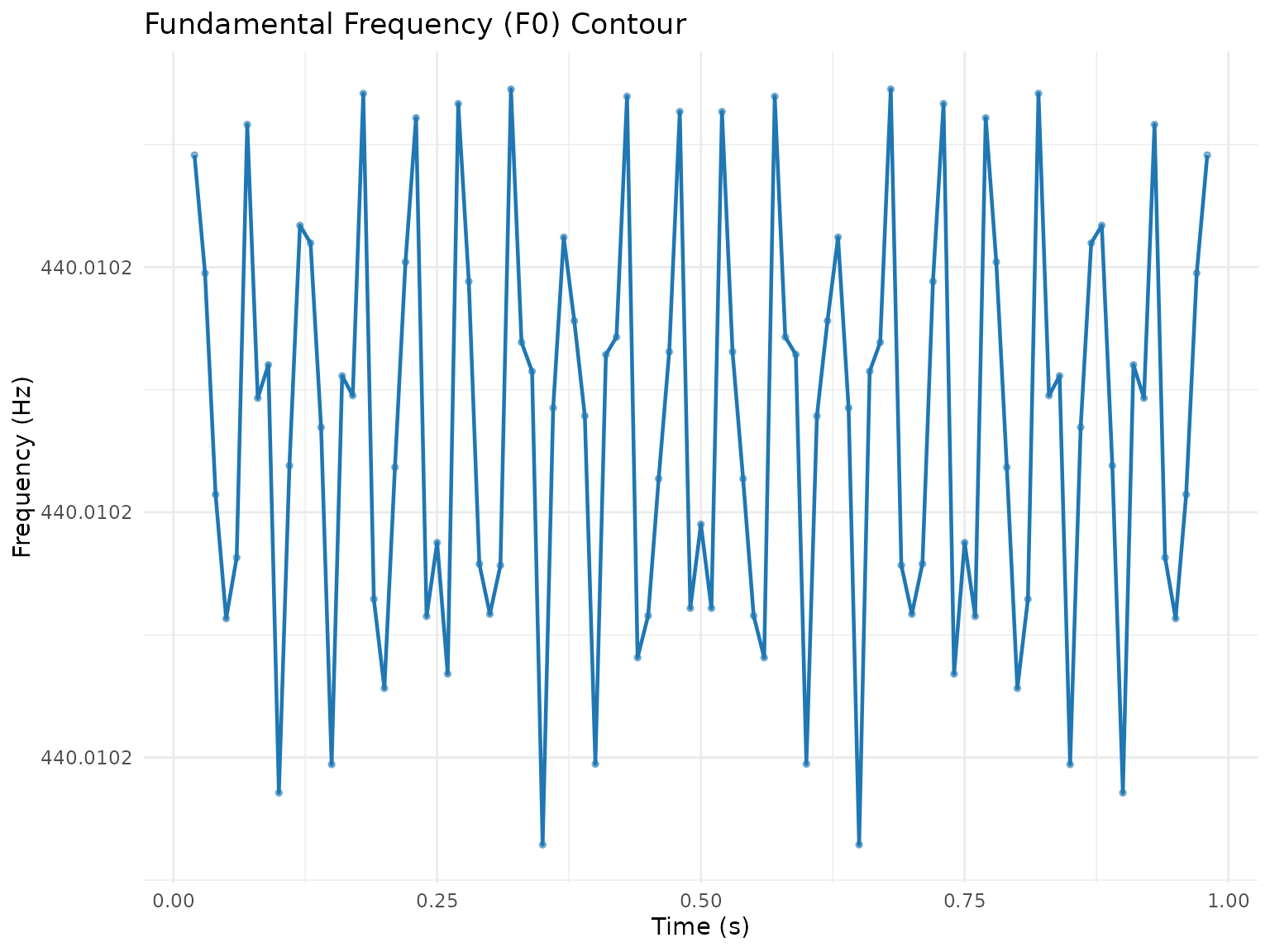
Intensity Contour
# Extract intensity
intensity <- sound$to_intensity()

# Convert to data frame
intensity_df <- intensity$as_data_frame()

# Plot intensity contour
ggplot(intensity_df, aes(x = time, y = intensity_db)) +
  geom_line(color = "#ff7f0e", linewidth = 0.8) +
  geom_area(fill = "#ff7f0e", alpha = 0.3) +
  labs(
    title = "Intensity Contour",
    x = "Time (s)",
    y = "Intensity (dB)"
  ) +
  theme_minimal()
Combined Pitch and Intensity
Pitch and intensity are extracted on different time grids, so
intensity is interpolated onto the pitch time points with
stats::approx() before plotting:
combined <- data.frame(
  time = pitch_df$time,
  frequency = pitch_df$frequency,
  intensity_db = approx(intensity_df$time, intensity_df$intensity_db,
                         xout = pitch_df$time)$y
)

# Dual-axis plot
ggplot(combined, aes(x = time)) +
  geom_line(aes(y = frequency, color = "F0"), linewidth = 0.8) +
  geom_line(aes(y = intensity_db * 3, color = "Intensity"), linewidth = 0.8) +
  scale_y_continuous(
    name = "Frequency (Hz)",
    sec.axis = sec_axis(~./3, name = "Intensity (dB)")
  ) +
  scale_color_manual(
    name = "",
    values = c("F0" = "#1f77b4", "Intensity" = "#ff7f0e")
  ) +
  labs(
    title = "Pitch and Intensity",
    x = "Time (s)"
  ) +
  theme_minimal() +
  theme(legend.position = "top")
#> Warning: Removed 4 rows containing missing values or values outside the scale range
#> (`geom_line()`).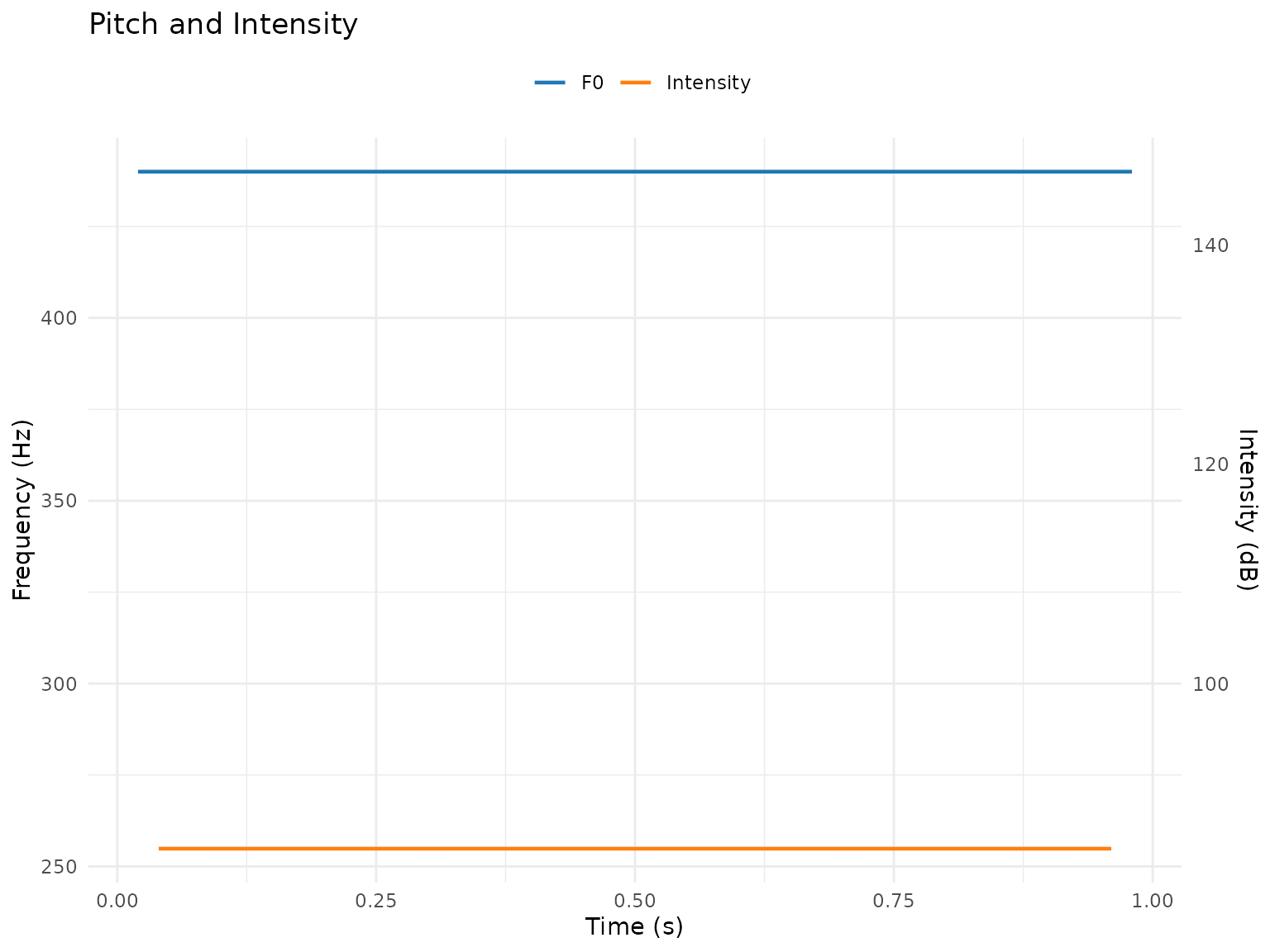
TextGrid Visualization
pladdrr provides autoplot.TextGrid() and
autolayer.TextGrid() methods, so plotting a tier does not
require manually looping over intervals and building
geom_rect()/geom_text() calls.
Annotation Tier Display
# Load TextGrid
tg <- TextGrid$new(system.file("extdata", "test.TextGrid", package = "pladdrr"))

# autoplot() draws the whole TextGrid (all tiers stacked), delegating to the
# base plot.TextGrid() method
autoplot(tg)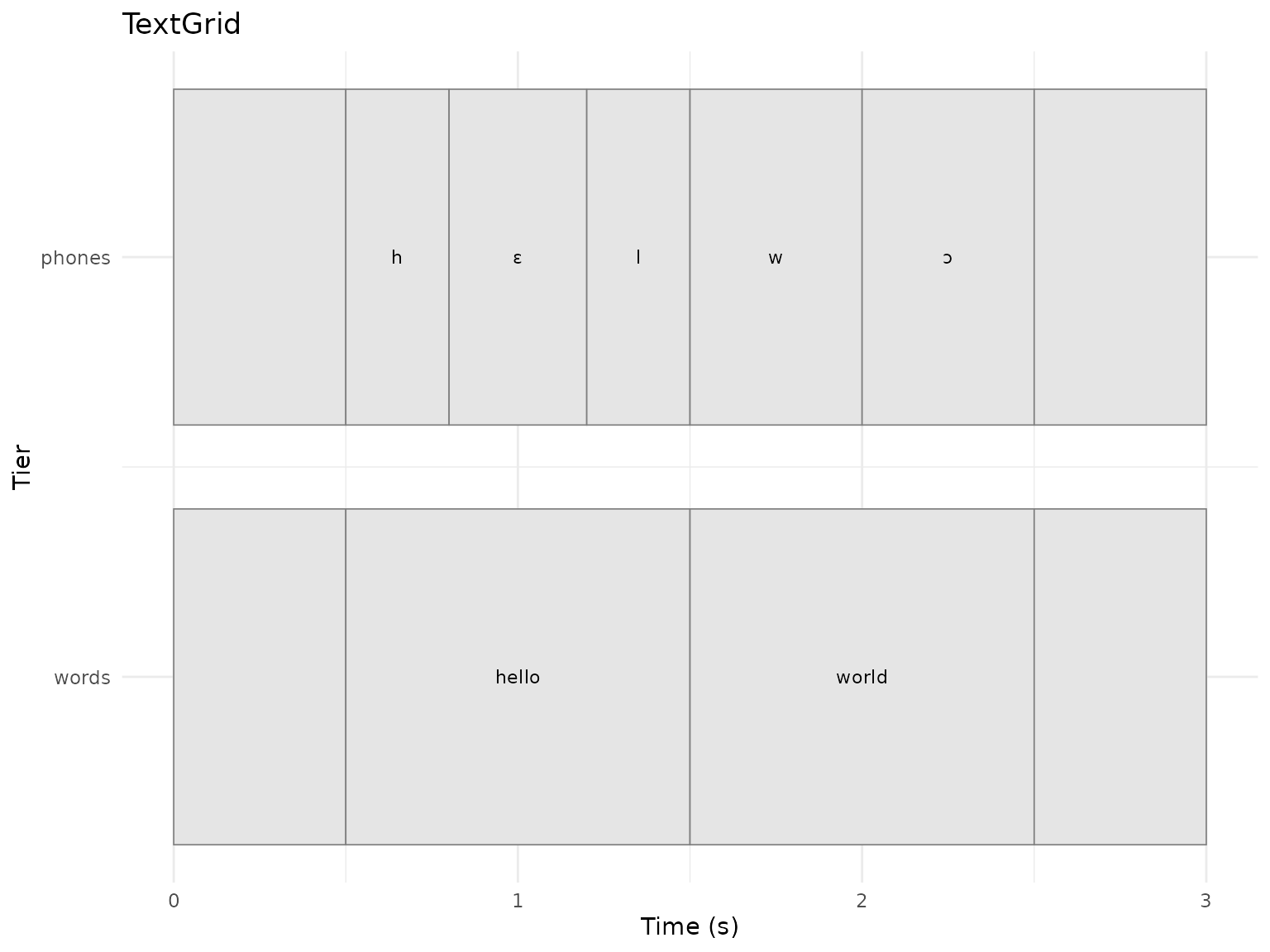
# autolayer() returns a list of geoms for a single tier, for use inside a
# ggplot2 pipeline (e.g. layered over a Sound waveform or spectrogram)
ggplot() +
  autolayer(tg, tier = "words", color = "steelblue") +
  labs(title = "Word Tier", x = "Time (s)", y = "") +
  theme_minimal()
ggplot() +
  autolayer(tg, tier = "phones", color = "darkgreen", alpha = 0.4) +
  labs(title = "Phone Tier", x = "Time (s)", y = "") +
  theme_minimal()
Duration Analysis
# Interval durations for the "phones" tier, via get_all_intervals()
tier_data <- tg$get_all_intervals("phones")
tier_data$duration <- tier_data$end - tier_data$start

# Filter out empty (unlabeled) intervals
tier_data_labeled <- tier_data[tier_data$text != "", ]

# Duration histogram by label
ggplot(tier_data_labeled, aes(x = duration, fill = text)) +
  geom_histogram(bins = 10, alpha = 0.7, color = "black") +
  facet_wrap(~text, scales = "free_y") +
  labs(
    title = "Interval Duration Distribution",
    x = "Duration (s)",
    y = "Count"
  ) +
  theme_minimal() +
  theme(legend.position = "none")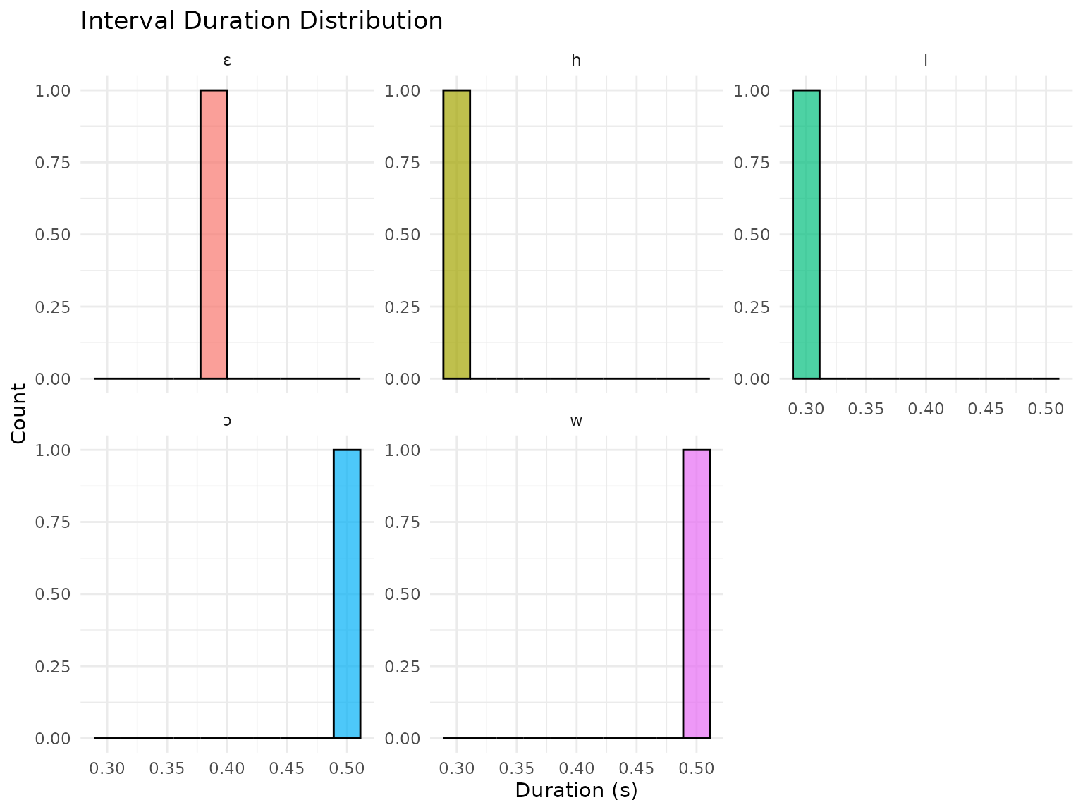
Spectral Visualization
Spectrogram
# Create spectrogram
sound <- Sound$new(system.file("extdata", "test.wav", package = "pladdrr"))
spectrogram <- sound$to_spectrogram(
  window_length = 0.005,
  max_frequency = 5000,
  time_step = 0.002,
  frequency_step = 20,
  window_shape = "Gaussian"
)

# Convert to matrix for plotting (rows = frequency, columns = time)
spec_matrix <- spectrogram$as_matrix()
time_vec <- seq(0, sound$get_total_duration(), length.out = ncol(spec_matrix))
freq_vec <- seq(0, 5000, length.out = nrow(spec_matrix))

# Long-format data frame for ggplot2 (base R, no reshape dependency)
spec_long <- expand.grid(time = time_vec, frequency = freq_vec)
spec_long$power <- as.vector(t(spec_matrix))

# Plot spectrogram
ggplot(spec_long, aes(x = time, y = frequency, fill = power)) +
  geom_tile() +
  scale_fill_viridis_c(option = "magma", name = "Power (dB)") +
  labs(
    title = "Spectrogram",
    x = "Time (s)",
    y = "Frequency (Hz)"
  ) +
  theme_minimal()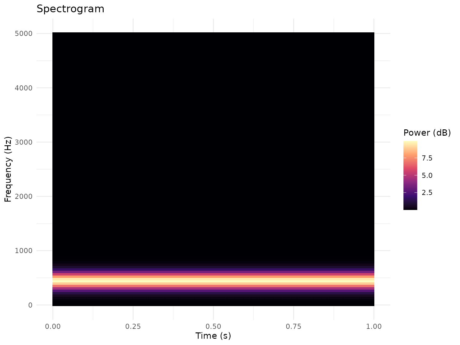
Spectrum
# Create spectrum from sound
spectrum <- sound$to_spectrum(fast = TRUE)

# Convert to data frame
spectrum_df <- spectrum$as_data_frame()

# Plot spectrum
ggplot(spectrum_df, aes(x = frequency, y = power)) +
  geom_line(color = "#2ca02c", linewidth = 0.8) +
  labs(
    title = "Power Spectrum",
    x = "Frequency (Hz)",
    y = "Power (dB)"
  ) +
  theme_minimal()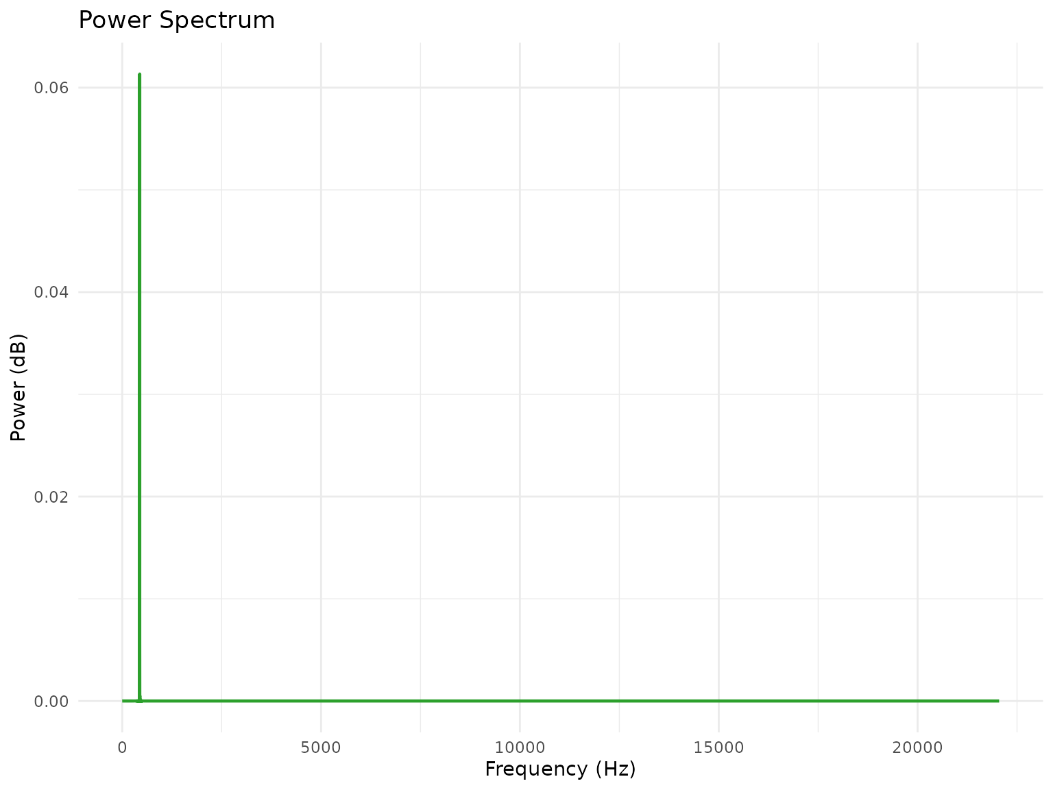
Long-Term Average Spectrum (LTAS)
# Create LTAS
ltas <- sound$to_ltas(bandwidth = 100)

# Convert to data frame
ltas_df <- ltas$as_data_frame()

# Plot LTAS
ggplot(ltas_df, aes(x = frequency, y = power_db)) +
  geom_line(color = "#d62728", linewidth = 0.8) +
  geom_area(fill = "#d62728", alpha = 0.3) +
  labs(
    title = "Long-Term Average Spectrum",
    x = "Frequency (Hz)",
    y = "Power (dB)"
  ) +
  theme_minimal()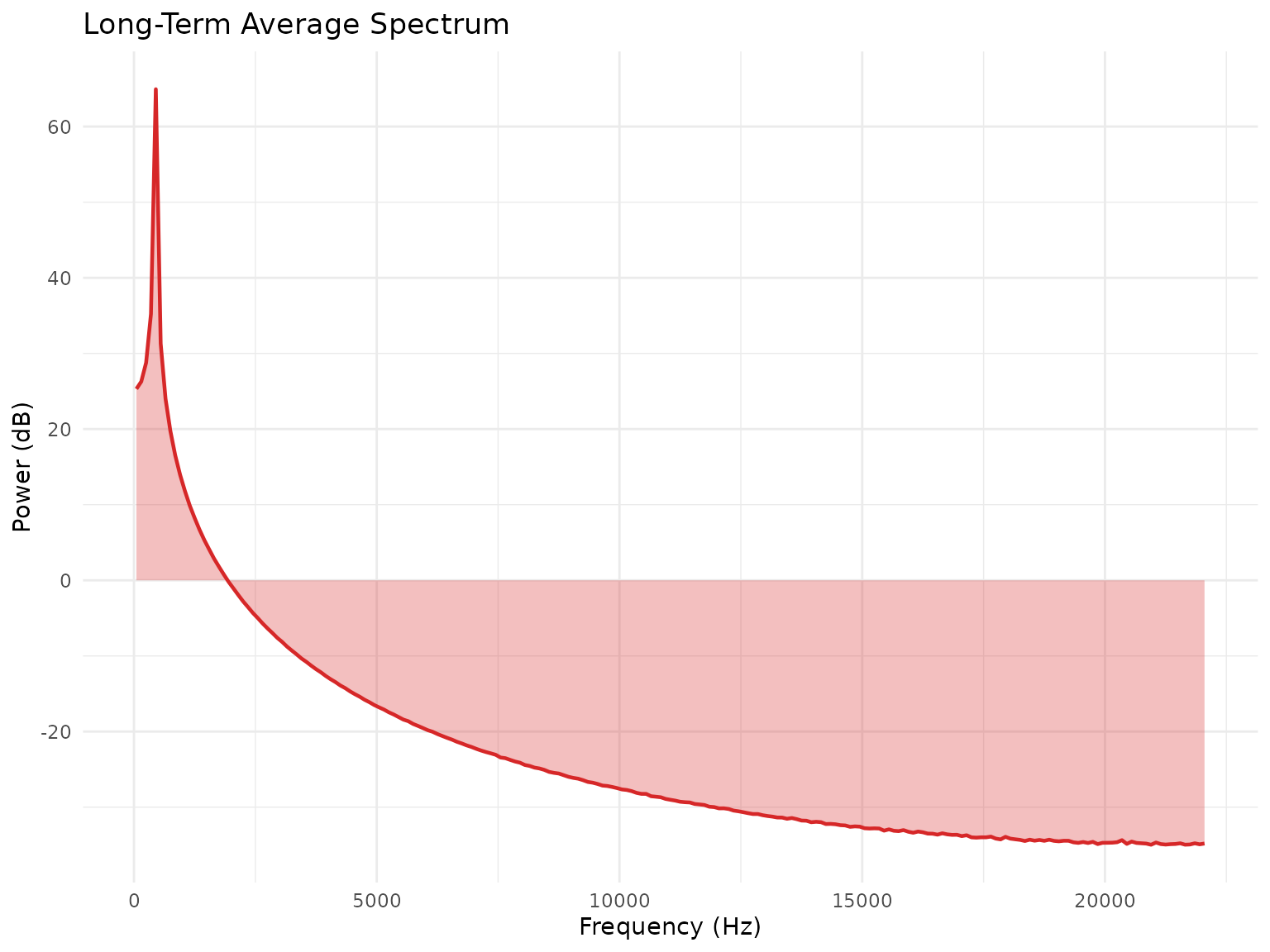
Customization and Theming
Custom Color Schemes
# Define custom color palette
my_colors <- c(
  "#E69F00",  # Orange
  "#56B4E9",  # Sky Blue
  "#009E73",  # Green
  "#F0E442",  # Yellow
  "#0072B2",  # Blue
  "#D55E00",  # Vermillion
  "#CC79A7"   # Purple
)

# Apply to vowel space plot
ggplot(formant_data, aes(x = F2, y = F1, color = vowel)) +
  geom_point(size = 4) +
  scale_color_manual(values = my_colors) +
  scale_x_reverse() +
  scale_y_reverse() +
  theme_minimal()
#> Warning: Removed 4 rows containing missing values or values outside the scale range
#> (`geom_point()`).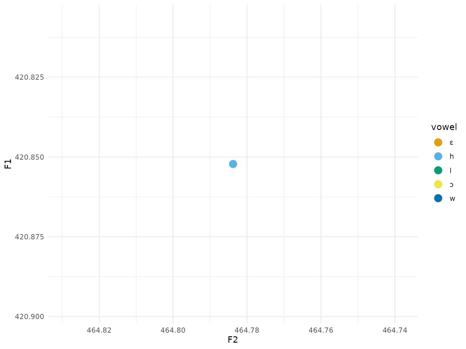
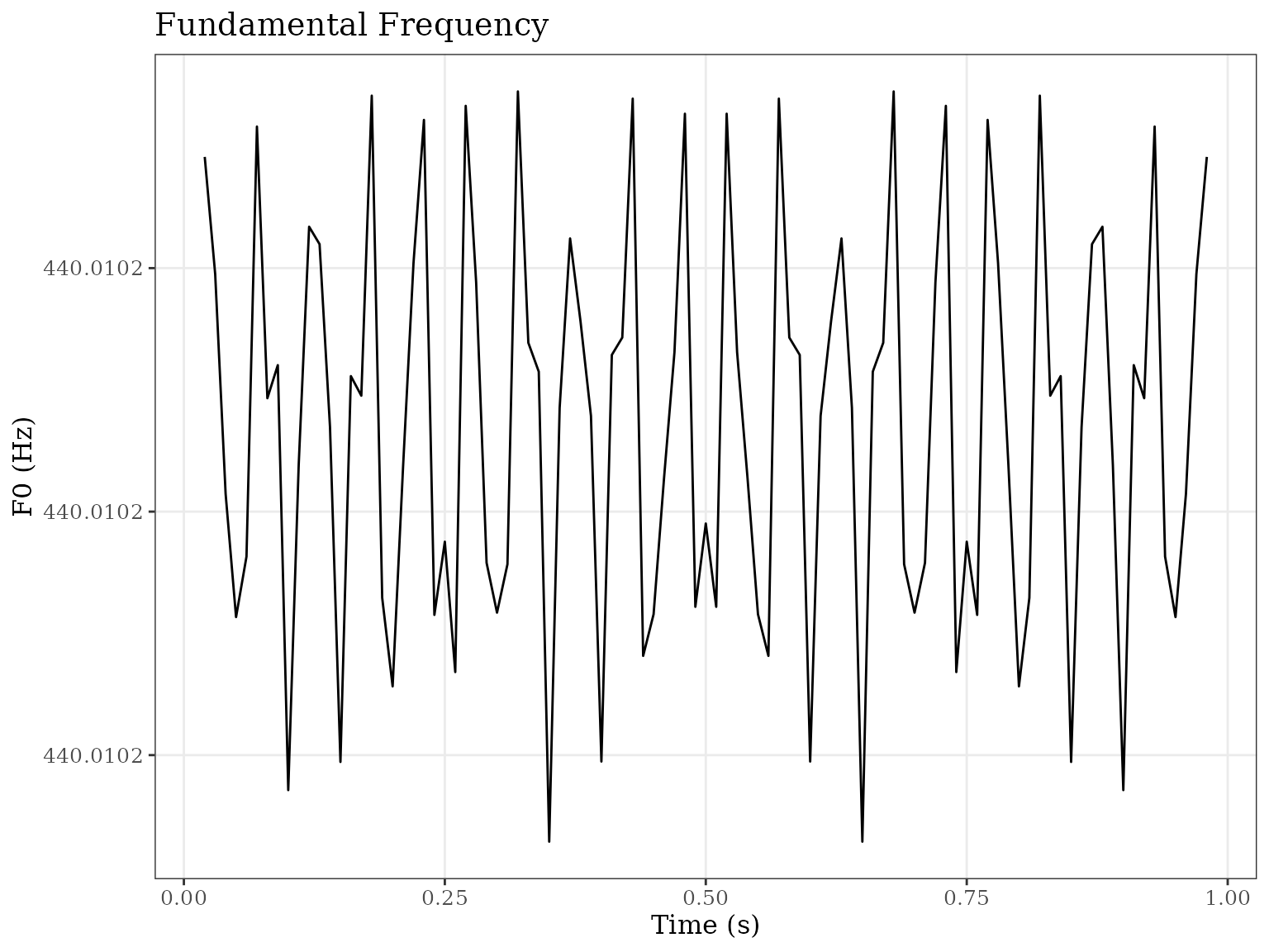
Publication Themes
# Black and white theme for journals
ggplot(pitch_df, aes(x = time, y = frequency)) +
  geom_line() +
  labs(
    title = "Fundamental Frequency",
    x = "Time (s)",
    y = "F0 (Hz)"
  ) +
  theme_bw() +
  theme(
    panel.grid.minor = element_blank(),
    text = element_text(size = 12, family = "serif")
  )
Multi-Panel Figures
library(gridExtra)

# Create individual plots
p1 <- ggplot(pitch_df, aes(x = time, y = frequency)) +
  geom_line() +
  labs(title = "Pitch", x = "Time (s)", y = "F0 (Hz)") +
  theme_minimal()

p2 <- ggplot(intensity_df, aes(x = time, y = intensity_db)) +
  geom_line() +
  labs(title = "Intensity", x = "Time (s)", y = "dB") +
  theme_minimal()

p3 <- ggplot(formant_wide, aes(x = time)) +
  geom_line(aes(y = F1, color = "F1")) +
  geom_line(aes(y = F2, color = "F2")) +
  labs(title = "Formants", x = "Time (s)", y = "Hz") +
  theme_minimal()

# Arrange in grid
grid.arrange(p1, p2, p3, nrow = 3)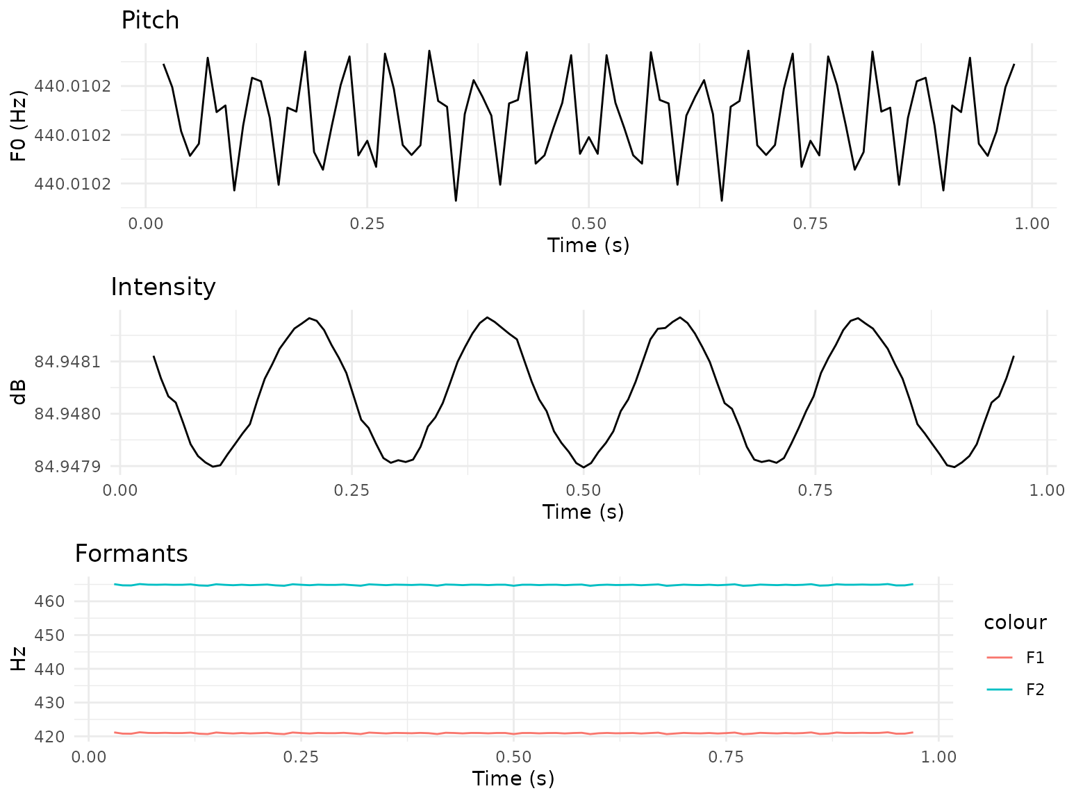
Saving Plots
High-Resolution Output
# Save as PDF (vector graphics)
ggsave("figure1.pdf", plot = p1, width = 8, height = 6, units = "in")

# Save as PNG (high DPI)
ggsave("figure1.png", plot = p1, width = 8, height = 6, dpi = 300)

# Save as SVG (editable vector)
ggsave("figure1.svg", plot = p1, width = 8, height = 6)

# Save as TIFF (for journals)
ggsave("figure1.tiff", plot = p1, width = 8, height = 6, dpi = 300,
compression = "lzw")Summary
This vignette covered:
Cepstral analysis:
plot_powercepstrum( ),plot_powercepstrogram(),plot_cpp_timeseries(),create_cepstrum_report()-
Formant analysis: F1-F2 formant space and F1-F3 trajectories from `Formant$as_data_frame(
)`
Prosodic features: pitch and intensity contours from
Pitch$as_data_frame( )andIntensity$as_data_frame()Annotation: TextGrid tier display via
autoplot.TextGrid( )andautolayer.TextGrid()-
Spectral analysis: spectrograms, spectra, and LTAS from the corresponding `as_matrix(
)
/as_data_frame()` methods
All examples produce ordinary ggplot2 objects that can
be themed, combined with `gridExtra::grid.arrange(
), and saved withggsave()`.
For more information on specific acoustic analyses, see:
-
vignette("getting-started")- Basic workflow -
vignette("integrated-phonetic-analysis")- Multi-parameter analysis -
vignette("textgrid-workflows")- Annotation-based analysis -
vignette( "autoplot-autolayer")- Full reference for theautoplot/autolayermethods