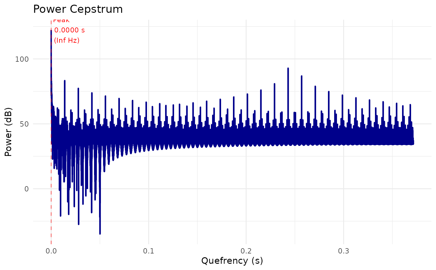
Creates a visualization of a PowerCepstrum object showing the cepstral coefficients as a function of quefrency. Optionally highlights the peak related to pitch.
Usage
# S3 method for class 'PowerCepstrum'
plot(
  x,
  from_quefrency = NULL,
  to_quefrency = NULL,
  garnish = TRUE,
  title = "Power Cepstrum",
  color = "darkblue",
  mark_peak = TRUE,
  ...
)
Arguments
- x
PowerCepstrum object
- from_quefrency
Start quefrency in seconds (NULL = from beginning)
- to_quefrency
End quefrency in seconds (NULL = to end)
- garnish
Logical. Add axis labels and title (default: TRUE)
- title
Character. Plot title (default: "Power Cepstrum")
- color
Character. Line color (default: "darkblue")
- mark_peak
Logical. Mark the peak prominence if available (default: TRUE)
- ...
Additional arguments passed to the underlying function or ignored.
Examples
sound <- Sound$create_tone(frequency = 220, duration = 0.5)
spectrum <- sound$to_spectrum()
pc <- spectrum$to_power_cepstrum()
# Basic plot
plot(pc)
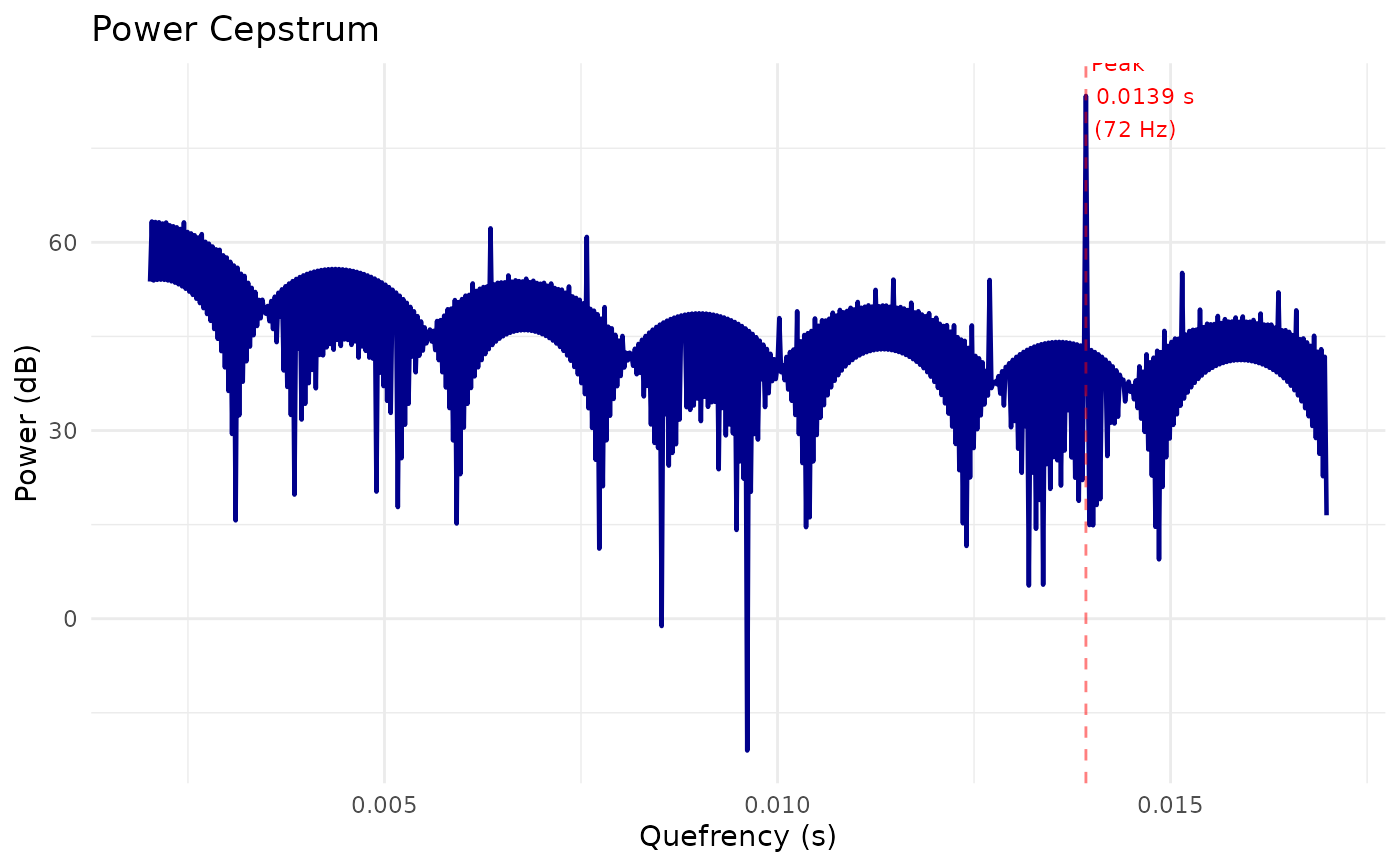
 # Focus on vocal range (60-500 Hz = 0.002-0.0167 s quefrency)
plot(pc, from_quefrency = 0.002, to_quefrency = 0.017)
# Focus on vocal range (60-500 Hz = 0.002-0.0167 s quefrency)
plot(pc, from_quefrency = 0.002, to_quefrency = 0.017)
 # Customize
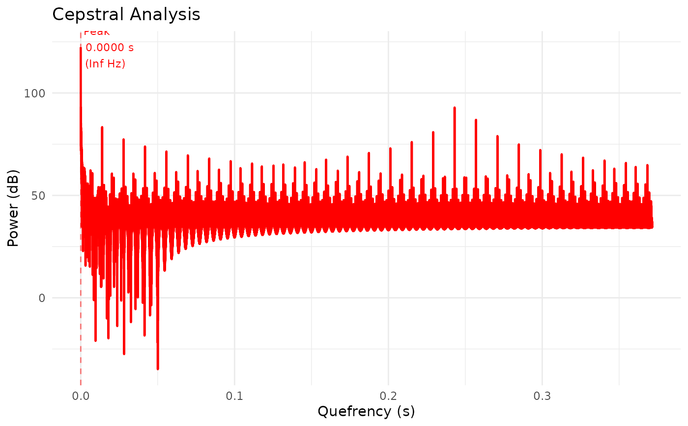
plot(pc, color = "red", title = "Cepstral Analysis")
# Customize
plot(pc, color = "red", title = "Cepstral Analysis")