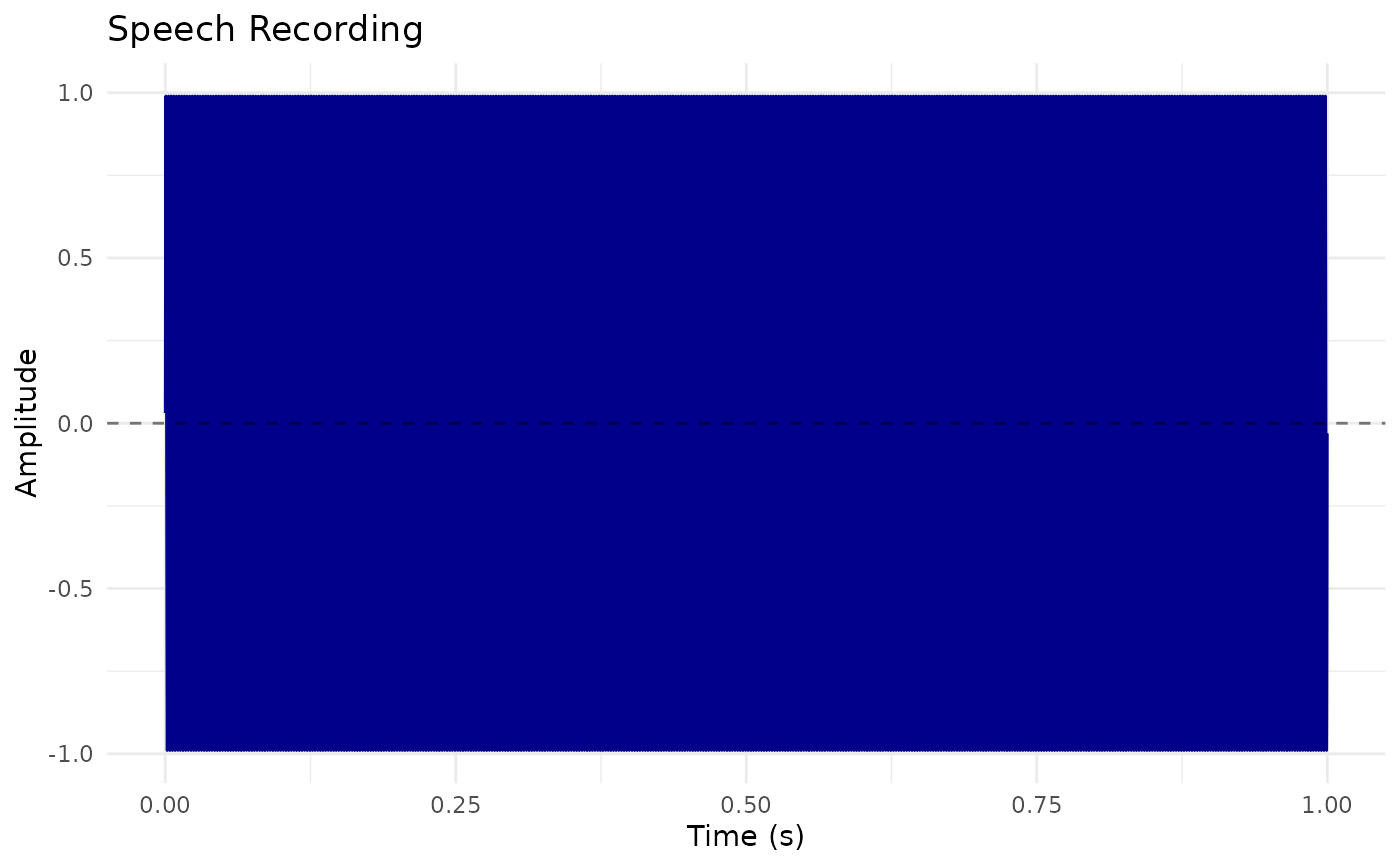
Creates a waveform visualization of a Sound object.
Usage
# S3 method for class 'Sound'
plot(
  x,
  from_time = NULL,
  to_time = NULL,
  garnish = TRUE,
  title = "Sound",
  color = "steelblue",
  ...
)
Arguments
- x
Sound object
- from_time
Start time in seconds (NULL = from beginning)
- to_time
End time in seconds (NULL = to end)
- garnish
Logical. Add axis labels and title (default: TRUE)
- title
Character. Plot title (default: "Sound")
- color
Character. Line color (default: "steelblue")
- ...
Additional arguments passed to the underlying function or ignored.
Examples
sound <- Sound$create_tone(frequency = 440, duration = 1.0)
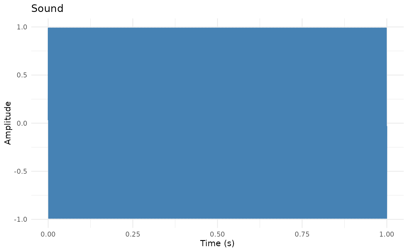
# Basic plot
plot(sound)
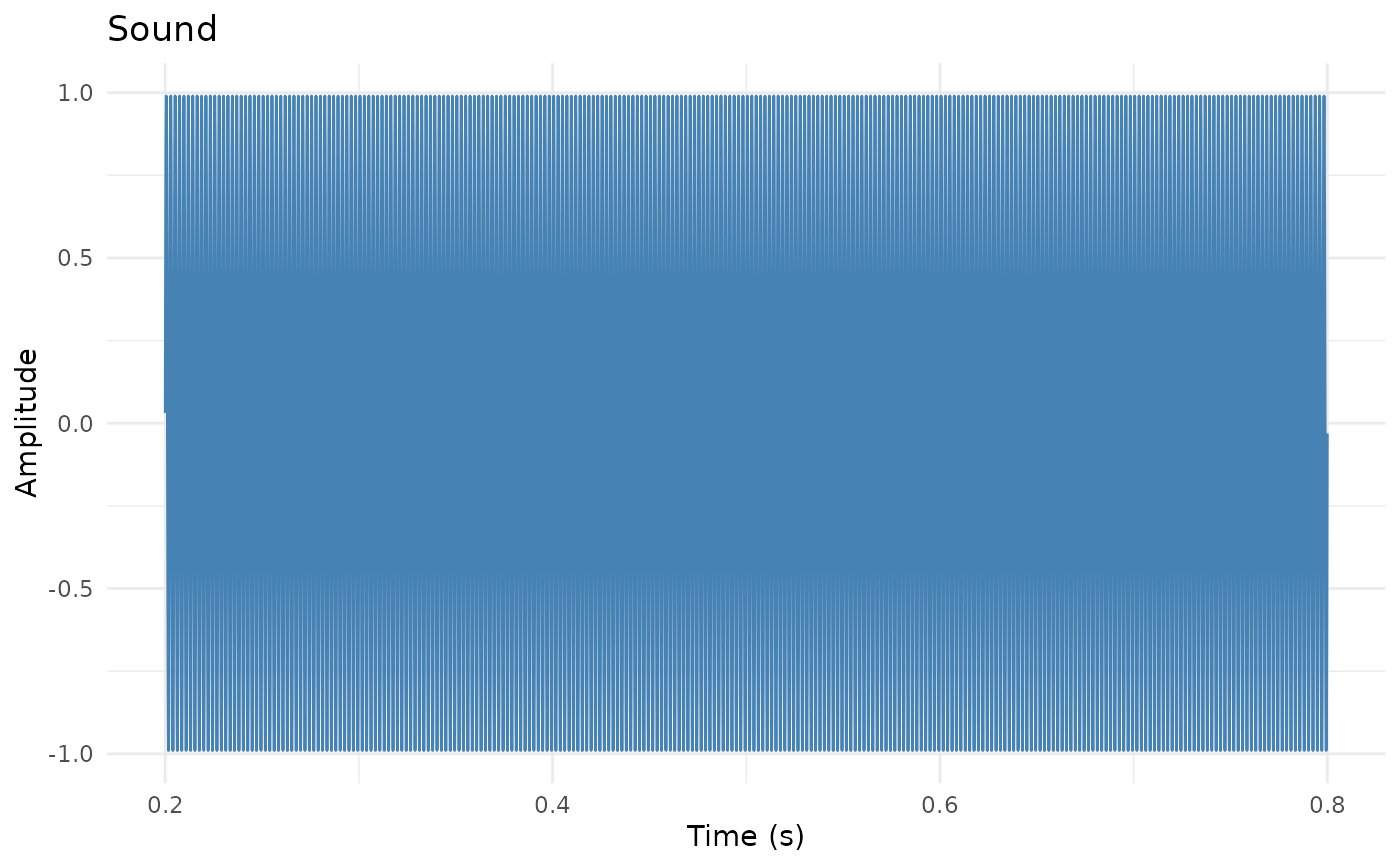
 # Time range
plot(sound, from_time = 0.2, to_time = 0.8)
# Time range
plot(sound, from_time = 0.2, to_time = 0.8)
 # Customize
plot(sound, color = "darkblue", title = "Speech Recording") +
ggplot2::geom_hline(yintercept = 0, linetype = "dashed", alpha = 0.5)
# Customize
plot(sound, color = "darkblue", title = "Speech Recording") +
ggplot2::geom_hline(yintercept = 0, linetype = "dashed", alpha = 0.5)